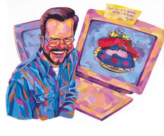
The reason that I posted this as well was to show the color change from this to print. As you can see, in comparision with the previous page, the colors were really subdued, totally calm, unlike the printed version which seems like it was practically in NEON colors. Almost every newsletter, the color would be an issue that I did my best with. It's a constant learning experience.